Cards In This Set
| Front | Back |
 - |
- Domenichino- Virgin and the Unicorn-1603-4-it's a fresco- fresco was a very important medium and all of annibale's students were trained in it- he is embracing landscape painting- not as careful use of light and shadow to create three dimensionality- his work doesn't have annibale's robust physical presence- his figures are light and graceful- faces have a specific Domenichino look
|
 - |
- Domenichino- Santa Cecilia Before the Judge- 1613-4- Santa Cecilia had a revived popularity- patron saint of music- Council of Trent said artists should not overpopulate their images- be clear and direct
|
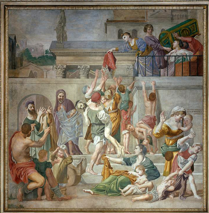 - |
- Domenichino- Santa Cecilia Distributing Alms-1612-14- very clear, triangular, well organized composition
|
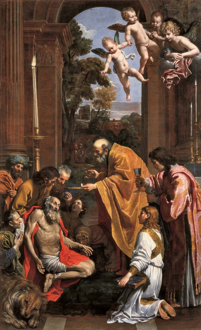 - |
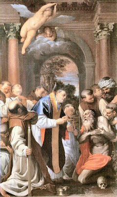 - Domenichino- Last Communion of St Jerome- 1614- reinforces importance of church mass during the reformation- power of clarity- edited version of Carracci's "Last Communion of St Jerome". he gets rid of extra gestures and gives the viewer access of entry so it is more easily read - impact of Council of Trent - more pared down |
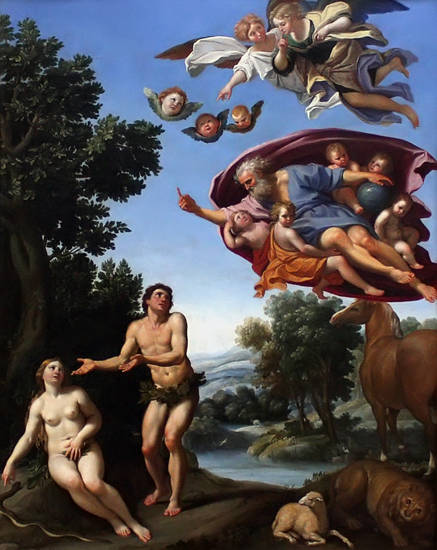 - |
- Domenichino- Expulsion of Adam and Eve- 1623- overly clear- copies michelangelo but disregards the grand sense of majesty for clarity- looks silly
|
 - |
- Guido Reni-Crucifixion of Peter- 1604-5- he uses a caravaggesque style in order to challenge it- simple, orderly composition- gesture of peter reaching up towards the nail- attractive image but does not have the power to draw the viewer in
|
 - |
- Guido Reni- Birth of the Virgin- 1609- Quirinal Palace was converted for papal use and had a private chapel for for the pope. This chapel was decorated by artists headed by Guido.- painting is concerned with beauty and grace- he varies types of figures- beautiful color rhythms, flowing procession
|
 - |
- Guido Reni- Aurora- 1614- it's a fresco- he didnt like fresco and eventually gave up working with it- beautiful rhythms of drapery, movement, facial types, etc.
|
 - |
- Guido Reni- Atalanta and Hippomenes"- early 1620's- Guido reached his height with two figure compositions- Hippomenes gesture of disgust reveals Guido's hatred towards women- simple and majestic composition- legs crossed- sexual conquest, he's outsmarting her- not much tonal range- winner shown as graceful and smooth and loser bent and contorted
|
 - |
- Guido Reni- Nessus and Dejunaire- 1621- majestic joining of two majestic figures and drapery- grace, beauty- not about story or narrative, just beauty
|
 - |
- Guido Reni- Archangel Michael- 1635- strong diagonal axis- influence of Raphael- simple figures in compelling poses
|
 - |
- Guido Reni- Annunciation- 1628- exemplifies his later style- lighter color palate, looser brushwork-sweetness and overt religion- he had a big gambling problem
|
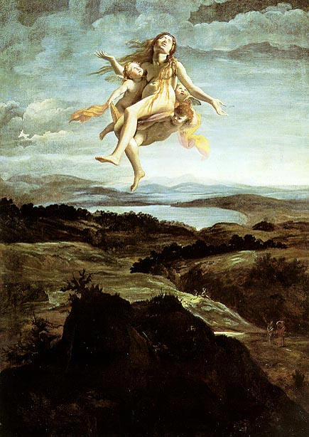 - |
- Lanfranco- Assumption of Mary Magdelene-1605- shows her in her difficult period of self denial- beautiful landscape- grand vista - Annibale's influence- more focus on the landscape than the saint
|
 - |
- Domenichino- Assumption of Mary Magdelene- 1620- focus on the saint, not the landscape
|
 - |
- Lanfranco- Virgin and Child with Saints Charles, Borromeo, and Bartholomew-1616- exemplifies his evolution in style- robust, powerful, three dimensional style- more about making it dynamic and energized
|


