Cards In This Set
| Front | Back |
|
Image |
Picasso, Guernica, 1937 They wanted instead to emphasize the two-dimensionality of the canvas. So they reduced and fractured objects into geometric forms, and then realigned these within a shallow, relieflike space. They also used multiple or contrasting vantage points. It attempts to mimic the mind's power to abstract and synthesize its different impressions of the world into new 'wholes'.
|
 Image |
Mondrian, New York City I, 1942
|
|
Can't find image...
|
Krasner, Blue Square, 1939-1943
|
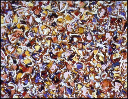 Image |
Krasner, Noon, 1947
busy painting and the repitition within the compostion creates a patterened effect. a mixture of colours can be seen within the composition warm, cold, complimentary all contribute toward the overall boldness of the image. the guestural application of the paint also goes toward giving the painting a very energetic look |
 Image |
Hofmann, Spring, 1940
|
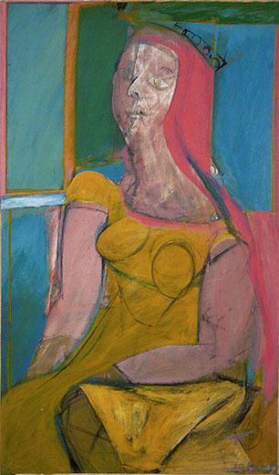 Img |
De Kooning, Queen of Hearts, 1943
|
 Img |
De Kooning, Painting, 1948
|
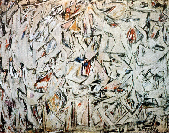 Img |
De Kooning, Excavation, 1950
|
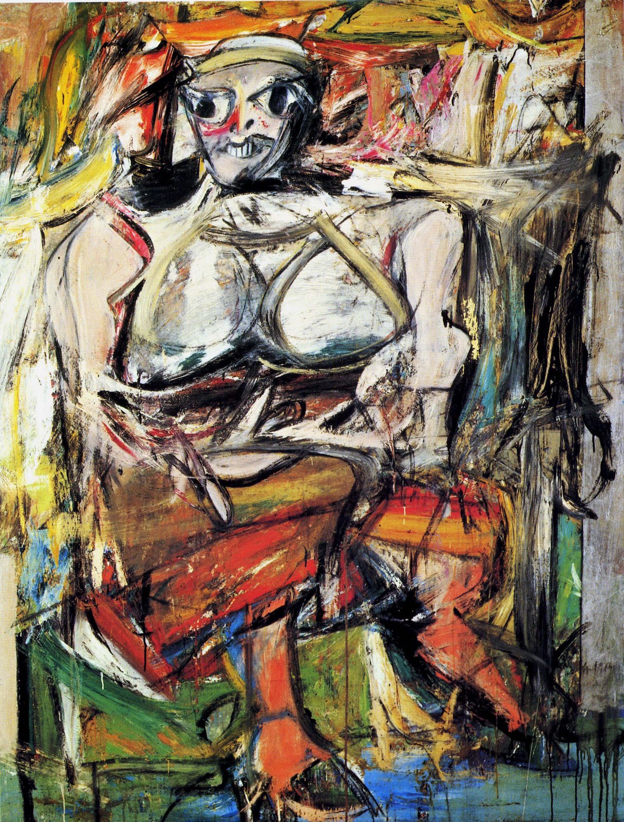 Img |
De Kooning, Woman I, 1950-52
|
 Img |
De Kooning, Easter Monday, 1955-56
|
 Img |
Pollock, Male and Female, 1942
|
 Img |
Pollock, Gothic, 1944
|
 Img |
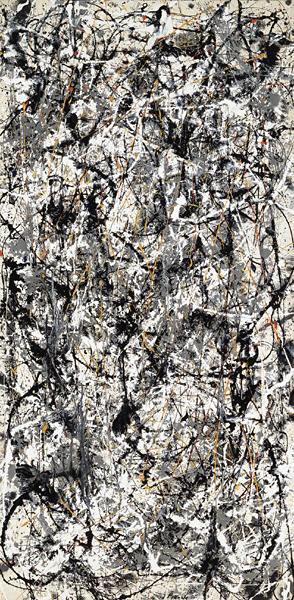
Pollock, Cathedral, 1947
|
 Img |
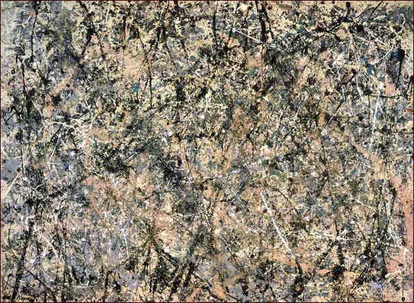
Pollock, Number One, 1950 (Lavender Mist)
|
 Img |
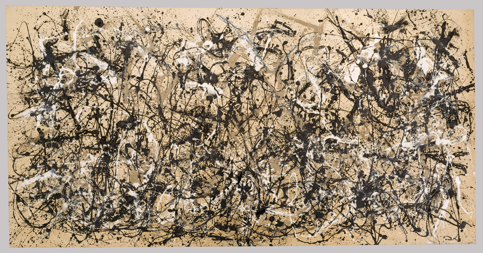
Pollock, Number 30, 1950 (Autumn Rhythm)
|


